appCompat 재질 디자인을 앱에 추가했는데 경고 대화 상자에서 기본, 기본 어두운 또는 강조 색을 사용하지 않는 것 같습니다.
내 기본 스타일은 다음과 같습니다.
<style name="MaterialNavyTheme" parent="@style/Theme.AppCompat.Light.DarkActionBar">
    <item name="colorPrimary">@color/apptheme_color</item>
    <item name="colorPrimaryDark">@color/apptheme_color_dark</item>
    <item name="colorAccent">@color/apptheme_color</item>
    <item name="android:textColorPrimary">@color/action_bar_gray</item>
</style>
내 이해를 바탕으로 대화 상자 버튼 텍스트 도이 색상을 사용해야합니다. 이해가 잘못 되었습니까? 아니면 더해야 할 일이 있습니까?
해결책:
표시된 답변이 올바른 길로 안내했습니다.
<style name="MaterialNavyTheme" parent="@style/Theme.AppCompat.Light.DarkActionBar">
    <item name="colorPrimary">@color/apptheme_color</item>
    <item name="colorPrimaryDark">@color/apptheme_color_dark</item>
    <item name="colorAccent">@color/apptheme_color</item>
    <item name="android:actionModeBackground">@color/apptheme_color_dark</item>
    <item name="android:textColorPrimary">@color/action_bar_gray</item>
    <item name="sdlDialogStyle">@style/DialogStyleLight</item>
    <item name="android:seekBarStyle">@style/SeekBarNavyTheme</item>
</style>

<style name="StyledDialog" parent="Theme.AppCompat.Light.Dialog">
    <item name="colorPrimary">@color/apptheme_color</item>
    <item name="colorPrimaryDark">@color/apptheme_color_dark</item>
    <item name="colorAccent">@color/apptheme_color</item>
</style>
답변
안드로이드 라이브러리의 머티리얼 컴포넌트로 2019 년 8 월에 업데이트 됨 :
Android 라이브러리 의 새로운 머티리얼 컴포넌트를 사용 com.google.android.material.dialog.MaterialAlertDialogBuilder하면 기존 androidx.appcompat.AlertDialog.Builder클래스 에서 확장되고 최신 머티리얼 디자인 사양을 지원 하는 새 클래스를 사용할 수 있습니다 .
다음과 같이 사용하십시오.
new MaterialAlertDialogBuilder(context)
            .setTitle("Dialog")
            .setMessage("Lorem ipsum dolor ....")
            .setPositiveButton("Ok", /* listener = */ null)
            .setNegativeButton("Cancel", /* listener = */ null)
            .show();
ThemeOverlay.MaterialComponents.MaterialAlertDialog스타일을 확장하는 색상을 사용자 정의 할 수 있습니다 .
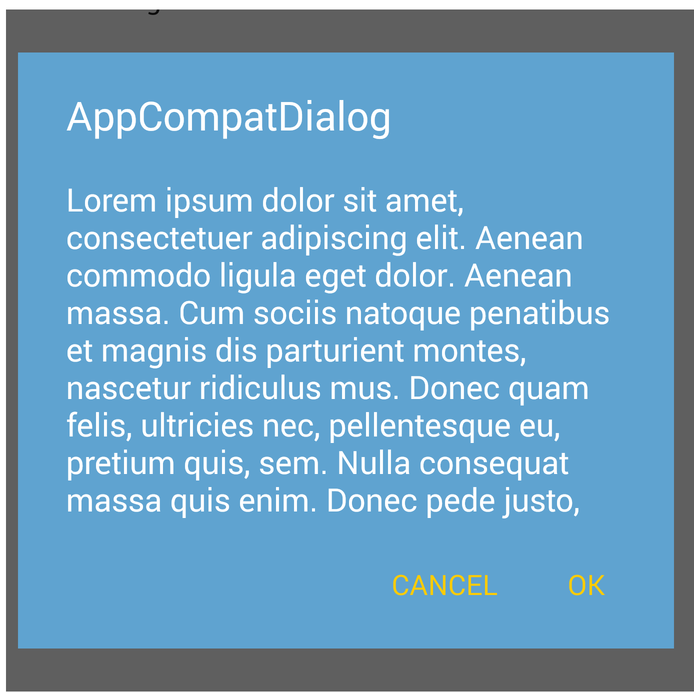
  <style name="CustomMaterialDialog" parent="@style/ThemeOverlay.MaterialComponents.MaterialAlertDialog">
     <!-- Background Color-->
     <item name="android:background">#006db3</item>
     <!-- Text Color for title and message -->
     <item name="colorOnSurface">@color/secondaryColor</item>
     <!-- Text Color for buttons -->
     <item name="colorPrimary">@color/white</item>
     ....
  </style>
사용자 정의 스타일을 적용하려면 생성자를 사용하십시오.
new MaterialAlertDialogBuilder(context, R.style.CustomMaterialDialog)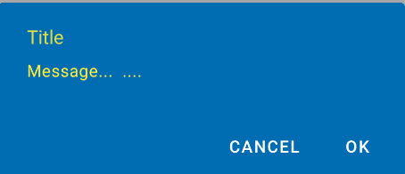
단추, 제목 및 본문 텍스트 를 사용자 정의 하려면 자세한 내용은 이 게시물 을 확인 하십시오.
앱 테마에서 스타일을 전체적으로 변경할 수도 있습니다 .
 <!-- Base application theme. -->
 <style name="AppTheme" parent="Theme.MaterialComponents.Light">
    ...
    <item name="materialAlertDialogTheme">@style/CustomMaterialDialog</item>
 </style>
지원 라이브러리 및 APPCOMPAT 테마 :
새로운으로 AppCompat v22.1새 사용할 수 있습니다 android.support.v7.app.AlertDialog을 .
다음과 같은 코드를 사용하십시오.
import android.support.v7.app.AlertDialog

AlertDialog.Builder builder =
       new AlertDialog.Builder(this, R.style.AppCompatAlertDialogStyle);
builder.setTitle("Dialog");
builder.setMessage("Lorem ipsum dolor ....");
builder.setPositiveButton("OK", null);
builder.setNegativeButton("Cancel", null);
builder.show();
그리고 다음과 같은 스타일을 사용하십시오.
<style name="AppCompatAlertDialogStyle" parent="Theme.AppCompat.Light.Dialog.Alert">
        <item name="colorAccent">#FFCC00</item>
        <item name="android:textColorPrimary">#FFFFFF</item>
        <item name="android:background">#5fa3d0</item>
    </style>
그렇지 않으면 현재 테마에서 정의 할 수 있습니다.
<style name="AppTheme" parent="Theme.AppCompat.Light">
    <!-- your style -->
    <item name="alertDialogTheme">@style/AppCompatAlertDialogStyle</item>
</style>
그런 다음 코드에서 :
 import android.support.v7.app.AlertDialog

    AlertDialog.Builder builder =
           new AlertDialog.Builder(this);
Kitkat의 AlertDialog :
답변
대화 상자 작성기를 초기화 할 때 두 번째 매개 변수를 테마로 전달하십시오. API 레벨 21의 머티리얼 디자인이 자동으로 표시됩니다.
AlertDialog.Builder builder = new AlertDialog.Builder(this, AlertDialog.THEME_DEVICE_DEFAULT_DARK);또는,
AlertDialog.Builder builder = new AlertDialog.Builder(this, AlertDialog.THEME_DEVICE_DEFAULT_LIGHT);답변
AppCompat은 대화 상자에서 그렇게하지 않습니다 (최소한은 아닙니다)
편집 : 이제 그렇습니다 . 사용하십시오android.support.v7.app.AlertDialog
답변
이 프로젝트를 고려할 수 있습니다 :
https://github.com/fengdai/AlertDialogPro
롤리팝과 거의 동일한 머티리얼 테마 경고 대화 상자를 제공 할 수 있습니다. 안드로이드 2.1과 호환됩니다.
답변
당신은 사용할 수 있습니다
머티리얼 디자인 라이브러리
머티리얼 디자인 라이브러리 는 예쁜 경고 대화 상자 , 버튼 및 스낵바 와 같은 다른 것들을 위해 만들어졌습니다 . 현재 많이 개발되었습니다.
가이드, 코드, 예제 -https : //github.com/navasmdc/MaterialDesignLibrary
Android Studio 1.0 에 라이브러리를 추가하는 방법 안내서 – 재질 디자인 라이브러리를 Android Studio로 가져 오려면 어떻게합니까?
.
행복한 코딩;)
답변
이 라이브러리를 사용해보십시오 :
https://github.com/avast/android-styled-dialogs
@afollestad의 것과 같은 DialogFragments대신에 기반합니다 AlertDialogs. 주요 장점 : 회전 후에 대화 상자가 닫히지 않고 콜백이 계속 작동합니다.
답변
어떤 이유로 android : textColor는 제목 색상 만 업데이트하는 것 같습니다. 를 사용하여 메시지 텍스트 색상을 변경할 수 있습니다
SpannableString.AlertDialog.Builder builder = new AlertDialog.Builder(new ContextThemeWrapper(this, R.style.MyDialogTheme));

AlertDialog dialog = builder.create();
                Spannable wordtoSpan = new SpannableString("I know just how to whisper, And I know just how to cry,I know just where to find the answers");
                wordtoSpan.setSpan(new ForegroundColorSpan(Color.BLUE), 15, 30, Spannable.SPAN_EXCLUSIVE_EXCLUSIVE);
                dialog.setMessage(wordtoSpan);
                dialog.show();