프레드를 만나십시오. 그는 테이블입니다.

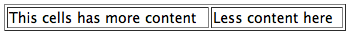
<table border="1" style="width: 100%;">
    <tr>
        <td>This cells has more content</td>
        <td>Less content here</td>
    </tr>
</table>
프레드의 아파트는 크기가 변하는 기괴한 습관을 가지고 있기 때문에 다른 모든 유닛을 밀지 않고 휘 포드 부인의 거실을 망각으로 밀어 넣지 않도록 일부 내용을 숨기는 법을 배웠습니다.
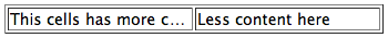
<table border="1" style="width: 100%; white-space: nowrap; table-layout: fixed;">
    <tr>
        <td style="overflow: hidden; text-overflow: ellipsis">This cells has more content</td>
        <td style="overflow: hidden; text-overflow: ellipsis">Less content here</td>
    </tr>
</table>
이것은 작동하지만 Fred는 오른쪽 셀 (셀 디토라는 별명)이 약간의 공간을 포기하면 왼쪽 셀이 많은 시간 동안 잘리지 않을 것이라는 잔소리를합니다. 그의 정신력을 구할 수 있습니까?
요약 : 표의 셀이 어떻게 고르게 오버플로 될 수 있으며 모든 공백을 모두 포기했을 때만 가능합니까?
답변
<table border="1" style="width: 100%;">
    <colgroup>
        <col width="100%" />
        <col width="0%" />
    </colgroup>
    <tr>
        <td style="white-space: nowrap; text-overflow:ellipsis; overflow: hidden; max-width:1px;">This cell has more content.This cell has more content.This cell has more content.This cell has more content.This cell has more content.This cell has more content.</td>
        <td style="white-space: nowrap;">Less content here.</td>
    </tr>
</table>
답변
JavaScript가 아닌 솔루션이 있다고 생각합니다! 결코 늦지 않는 것보다 낫지? 결국 이것은 훌륭한 질문이며 Google은 끝났습니다. 페이지가로드 할 수없는 후에 움직일 때 약간의 지터가 허용되지 않기 때문에 자바 스크립트 수정을 해결하고 싶지 않았습니다.
특징 :
- 자바 스크립트 없음
- 고정 레이아웃 없음
- 가중치 또는 백분율 폭 트릭 없음
- 여러 열과 함께 작동
- 간단한 서버 측 생성 및 클라이언트 측 업데이트 (계산 필요 없음)
- 크로스 브라우저 호환
작동 방식 : 테이블 셀 안에는 두 개의 다른 요소에 내용의 두 복사본을 상대적으로 배치 된 컨테이너 요소 내에 배치합니다. 스페이서 요소는 정적으로 배치되므로 테이블 셀의 너비에 영향을줍니다. 스페이서 셀의 내용물을 감싸도록함으로써 찾고있는 테이블 셀의 “최적의”너비를 얻을 수 있습니다. 이를 통해 절대적으로 배치 된 요소를 사용하여 보이는 컨텐츠의 너비를 상대적으로 배치 된 부모의 너비로 제한 할 수 있습니다.
IE8, IE9, IE10, Chrome, Firefox, Safari, Opera에서 테스트 및 작업
결과 이미지 :


JSFiddle : http://jsfiddle.net/zAeA2/
샘플 HTML / CSS :
<td>
<!--Relative-positioned container-->
<div class="container">
<!--Visible-->
<div class="content"><!--Content here--></div>
<!--Hidden spacer-->
<div class="spacer"><!--Content here--></div>
<!--Keeps the container from collapsing without
having to specify a height-->
<span> </span>
</div>
</td>
.container {
position: relative;
}
.content {
position: absolute;
max-width: 100%;
white-space: nowrap;
overflow: hidden;
text-overflow: ellipsis;
}
.spacer {
height: 0;
overflow: hidden;
}
답변
나는 며칠 전에 같은 도전에 직면했습니다. 루시퍼 샘 이 최고의 해결책을 찾은 것 같습니다 .
그러나 spacer 요소에서 내용을 복제해야한다는 것을 알았습니다. 그렇게 나쁘지는 않다고 생각했지만 title잘린 텍스트에 팝업 을 적용하고 싶습니다 . 그리고 그것은 긴 텍스트가 내 코드에서 세 번째로 나타날 것임을 의미합니다.
여기서는 의사 요소의 title속성 에 액세스 :after하여 스페이서를 생성하고 HTML을 깨끗하게 유지하도록 제안합니다 .
IE8 +, FF, Chrome, Safari, Opera에서 작동
<table border="1">
  <tr>
    <td class="ellipsis_cell">
      <div title="This cells has more content">
        <span>This cells has more content</span>
      </div>
    </td>
    <td class="nowrap">Less content here</td>
  </tr>
</table>
.ellipsis_cell > div {
    position: relative;
    overflow: hidden;
    height: 1em;
}

/* visible content */
.ellipsis_cell > div > span {
    display: block;
    position: absolute;
    max-width: 100%;
    white-space: nowrap;
    overflow: hidden;
    text-overflow: ellipsis;
    line-height: 1em;
}

/* spacer content */
.ellipsis_cell > div:after {
    content: attr(title);
    overflow: hidden;
    height: 0;
    display: block;
}
답변
Javascript가 수용 가능한 경우, 시작점으로 사용할 수있는 빠른 루틴을 작성했습니다. 창 크기 조정 이벤트에 반응하여 범위의 내부 너비를 사용하여 셀 너비를 동적으로 조정하려고 시도합니다.
현재 각 셀은 일반적으로 행 너비의 50 %를 차지한다고 가정하고 오른쪽 셀을 축소하여 왼쪽 셀을 최대 너비로 유지하여 오버플로를 방지합니다. 사용 사례에 따라 훨씬 더 복잡한 폭 밸런싱 로직을 구현할 수 있습니다. 도움이 되었기를 바랍니다:
테스트에 사용한 행의 마크 업 :
<tr class="row">
    <td style="overflow: hidden; text-overflow: ellipsis">
    <span>Lorem ipsum dolor sit amet, consectetur adipiscing elit.</span>
    </td>
    <td style="overflow: hidden; text-overflow: ellipsis">
    <span>Lorem ipsum dolor sit amet, consectetur adipiscing elit.</span>
    </td>
</tr>
크기 조정 이벤트를 연결하는 JQuery :
$(window).resize(function() {
    $('.row').each(function() {
        var row_width = $(this).width();
        var cols = $(this).find('td');
        var left = cols[0];
        var lcell_width = $(left).width();
        var lspan_width = $(left).find('span').width();
        var right = cols[1];
        var rcell_width = $(right).width();
        var rspan_width = $(right).find('span').width();

        if (lcell_width < lspan_width) {
            $(left).width(row_width - rcell_width);
        } else if (rcell_width > rspan_width) {
            $(left).width(row_width / 2);
        }
    });
});
답변
훨씬 더 쉽고 우아한 솔루션이 있습니다.
잘림을 적용하려는 테이블 셀 내에 css table-layout : fixed로 컨테이너 div를 포함하십시오. 이 컨테이너는 부모 테이블 셀의 전체 너비를 사용하므로 반응 형입니다.
표의 요소에 잘림을 적용하십시오.
IE8 +에서 작동
<table>
  <tr>
    <td>
     <div class="truncate">
       <h1 class="truncated">I'm getting truncated because I'm way too long to fit</h1>
     </div>
    </td>
    <td class="some-width">
       I'm just text
    </td>
  </tr>
</table>
그리고 CSS :
    .truncate {
      display: table;
      table-layout: fixed;
      width: 100%;
    }

    h1.truncated {
      overflow-x: hidden;
      text-overflow: ellipsis;
      white-space: nowrap;
    }
여기 작동하는 바이올린이 있습니다
https://jsfiddle.net/d0xhz8tb/
답변
문제는 균등 한 간격의 고정 너비 열을 생성하는 ‘table-layout : fixed’입니다. 그러나이 CSS 속성을 비활성화하면 테이블이 최대한 커지고 오버플로가 발생하지 않기 때문에 텍스트 오버플로가 중단됩니다.
죄송하지만이 경우 Fred는 케이크를 가지고 그것을 먹을 수 없습니다. 집주인이 Celldito에게 처음으로 작업 할 공간이 줄어들지 않으면 Fred는 그의 케이크를 사용할 수 없습니다.
답변
다음과 같이 특정 열에 “가중”을 시도 할 수 있습니다.
<table border="1" style="width: 100%;">
    <colgroup>
        <col width="80%" />
        <col width="20%" />
    </colgroup>
    <tr>
        <td>This cell has more content.</td>
        <td>Less content here.</td>
    </tr>
</table>
너비가 0 % 인 열을 사용하고 white-spaceCSS 속성을 조합하여 사용하는 등 좀 더 재미있는 조정을 시도 할 수도 있습니다.
<table border="1" style="width: 100%;">
    <colgroup>
        <col width="100%" />
        <col width="0%" />
    </colgroup>
    <tr>
        <td>This cell has more content.</td>
        <td style="white-space: nowrap;">Less content here.</td>
    </tr>
</table>
당신은 아이디어를 얻습니다.